Design System
JPMorgan Chase needed a new design system for its global web presence to align internal stakeholders and external agencies.
Millennium
Where
JPMorgan Chase & Co.
Who
Creative Direction, UX, UI
What
What was special about this:
The opportunity to design the global presence of a Fortune 500 company, one of the largest banks in the world—and create a design system that would provide structure and flexibility? Yes, please.
01
What was it?
JPMorgan Chase was between two systems—The first a mashup of raw HTML and the second, Adobe’s venerable CQ5 content platform. The task was to develop a unifying UX strategy and an elegant-yet-functional UI design that would support their needs now and over the next decade as they convert over to a new CMS platform (it ended up being Adobe Experience Manager)
02
Then what?
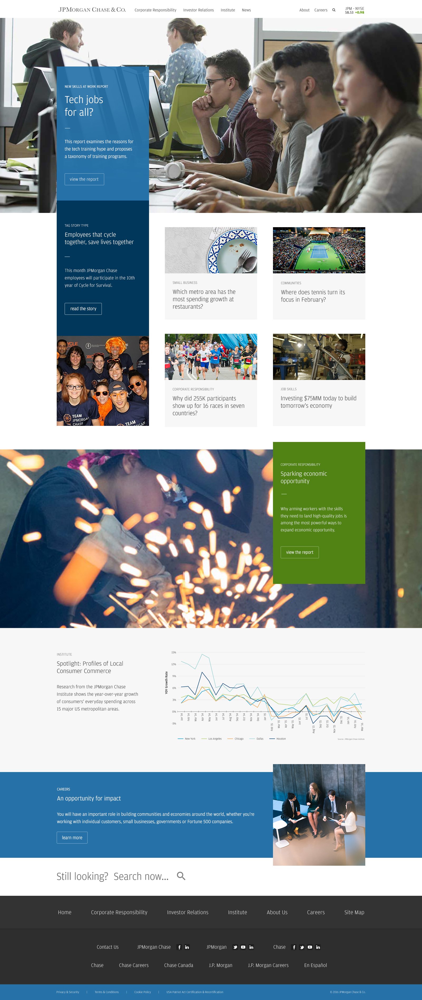
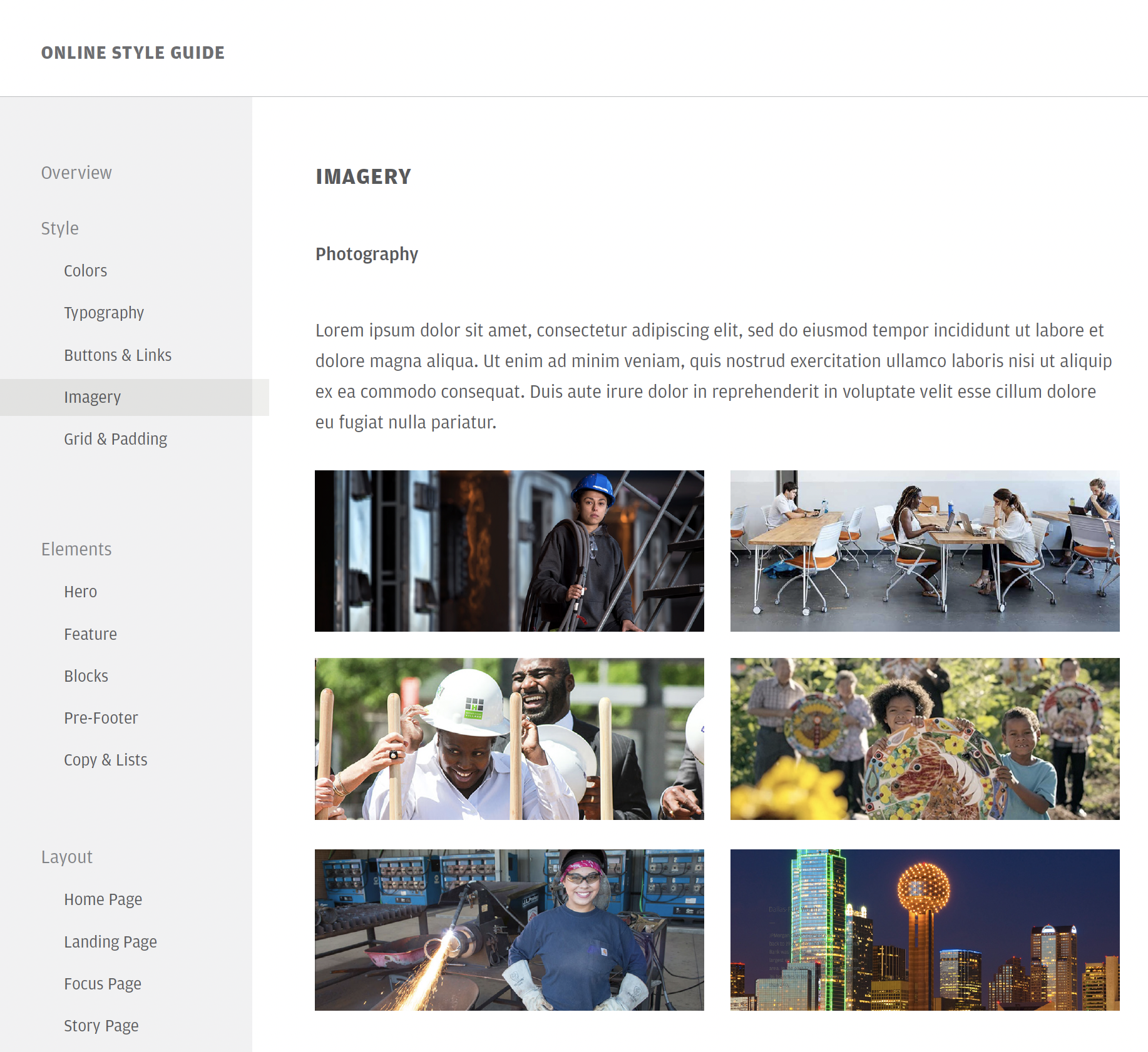
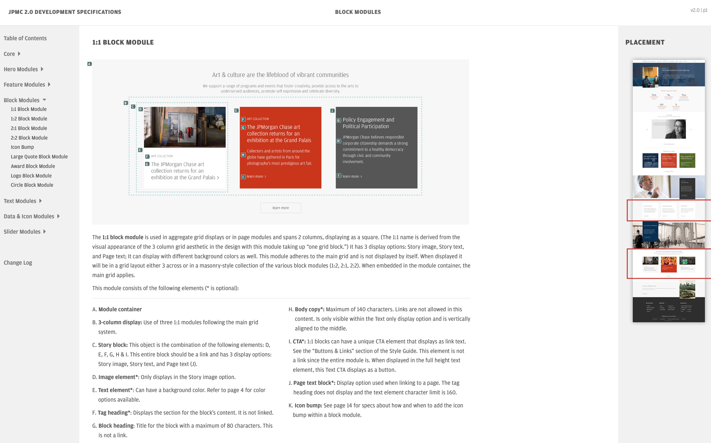
I led our efforts on the top level concept of how the design model would work: a series of modular, alternating, and overlayed elements guiding the eye through the content. Purposeful calls-to-action would follow shorter, more direct copy to achieve an overall better user experience. The second stage was to produce hundreds of page designs implementing the new system. The third stage was to create detailed specs that would communicate how to build the new modules including measurements, color definitions, font specs, and HTML examples into their newly acquired AEM Content Management Platform.
03
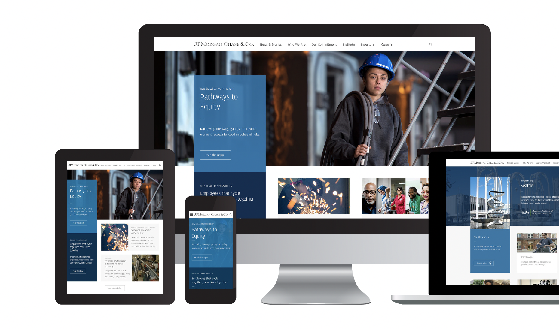
JPMC 2.0
That’s what we called it. And it’s intention was to modernize JPMorganChase’s web presence to help it compete (visually) with its competitors. It succeeded.